eDreams UX Redesign
A UX research and redesign project focused on improving the hotel booking experience on eDreams.net. Starting from user interviews and usability testing, I identified key friction points and redesigned the hotel detail page to reduce cognitive load and improve booking confidence.
Problem & Goals
eDreams is a third-party travel booking platform used by millions of users to search flights, hotels, and bundles. While the platform offers broad functionality, the hotel detail page presented significant usability gaps particularly around information organization, map utility, and visual density.
The goal of this project was to identify those friction points through structured user research and deliver a high-fidelity redesign that addressed them directly, without departing from the existing brand.
Research & findings
A moderated usability test was conducted in-person on Apr 22, 2026 with one participant: A 31-year-old who frequently uses the internet and has had prior experience booking online.
In the session, we covered 3 scenarios with 6 tasks:
1. Booking a last-minute flight,
2. Combining a flight and hotel booking, and
3. Locating cancellation and customer support information. The participant successfully completed all six tasks, from the booking process to checkout.
The participant completed all tasks successfully.
Key issues identified
Visual clutter & disorganization
Secondary content appeared above high-priority information like facilities, amenities, and check-in instructions. The participant flagged page organization as their top improvement priority.
Secondary content appeared above high-priority information like facilities, amenities, and check-in instructions. The participant flagged page organization as their top improvement priority.
Map functionality does not meet user expectations.
When using the map view, the participant found there was only a single pin displayed with no aggregate view of the nearby options. This limited the map’s utility for comparing hotel/airport proximity to potential interest spots.
Terminology Confusion
The participant expressed confusion regarding platform-specific labels such as “Prime,” “Flex,” and “Smart Choice.” These labels lacked distinction and its attempt to upsell the user was not effective.
Guest support barrier
Users who checked out as guests hit a mandatory login screen when trying to contact support post-booking, with no alternative path.
Default setting errors
The platform auto-filled two adults on the flight + hotel search and the date of birth fields accepted invalid inputs like "00" without error handling.
“I put ‘Show on Map’ but what is it showing? Just the map? Where are the pins? What if I’m trying to see which hotel is closest to Universal Studios?
”
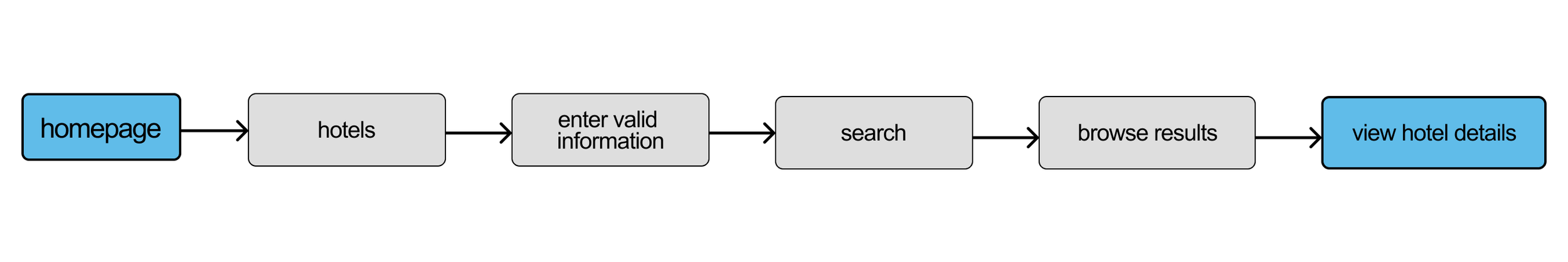
Design Process
The hotel detail page was selected as the primary redesign focus based on the density of issues identified during testing. The process moved from task flow to Crazy 8s ideation to a high-fidelity prototype in Figma.
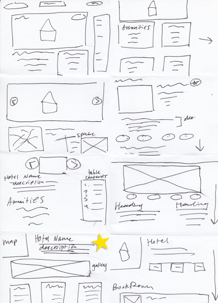
Crazy 8s Sketches
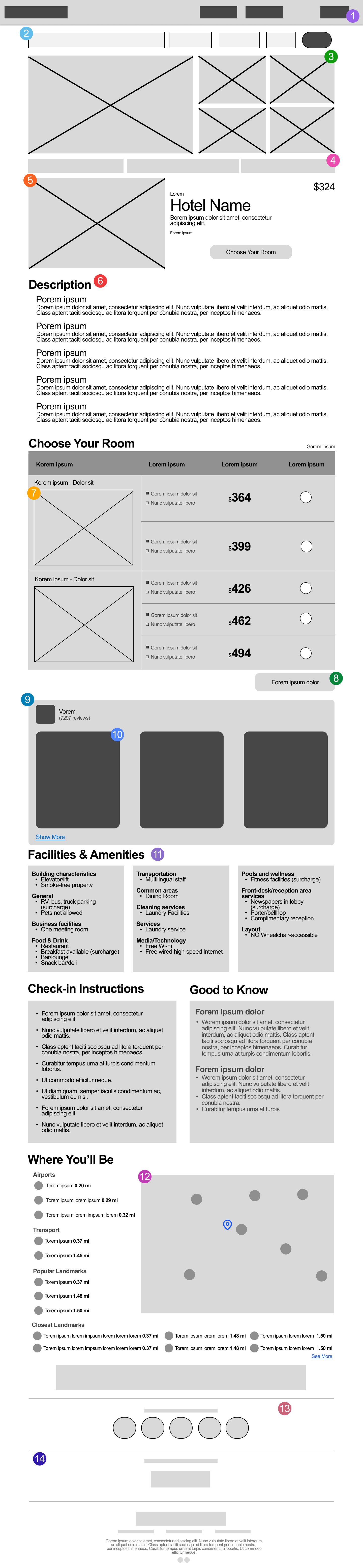
Mid-Fidelity Wireframe, based on chosen Crazy 8 Sketch.
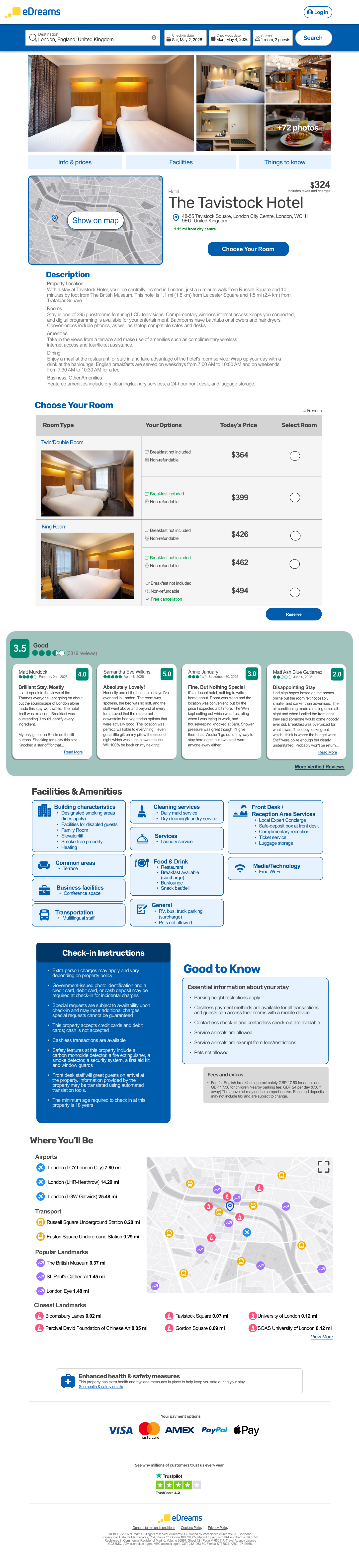
Core Design Decisions
Information Hierarchy Changes
In the original layout were made to directly address the user’s feedback regarding disorganization in the content.
The page was restructured using a top-to-bottom priority model: hotel name, gallery, pricing, description, room selection, reviews, facilities and amenities, check-in information, and the map. This sequence presents how exactly a user evaluates a hotel, moving from basic information to more specific details.
Additionally, the hotel name and pricing section was redesigned to include an embedded map preview to the left along with the key details, immediately showing the user the location when they first evaluate their options.Visual Design.
The facilities, amenities, check-in, and map sections were redesigned from plain lists into card components.
Research suggested that the original list format contributed to the visual overwhelm/clutter, making it harder for the user to skim through information. According to UX principles, card-based layouts follow web practices for grouping content and improving scannability. The cards were styled using a palette of light blue, dark blue, and grey tones to remain consistent with the eDreams company brand.
The Rubrik font was kept for headings as used on the live site and Arial being used for body text. The eDreams’ signature blue color was applied to section headings to reinforce brand identity and to help users orient themselves as they scroll. SVG icons alongside the facilities and amenities section were made more prominent to support faster scanning, allowing the user to identify relevant amenities at a glance without reading dense text.Review Panel.
The review panel was redesigned to improve usability. On the live site, users are limited to viewing a fixed set of reviews with no option to view more on the site. Research indicates that users feel more confident in their decision-making when being able to access large amounts of reviews by verified users.
The updated design introduces a “More Verified Reviews” option that will then allow users to filter their options, such as sorting by most recent, most helpful, most critical, etc. A green color was introduced in this section to distinguish it from the rest of the page to reflect TripAdvisor’s sourcing of the content.Map Redesign.
The “Where You’ll Be” Map section was redesigned to resolve the research finding that a single pin on the map proved to be insufficient for the user due to lack of geographical context.
The updated design features an aggregate view with multiple SVG markers representing nearby points of interest, along with an expandable map and an index panel categorizing the locations. These additions solve the gap seen in testing, where the participant found the map to be unhelpful and unable to support any meaningful location-based comparisons
Final Design & Rationale
Every decision in the redesign was centered around the results of the user research. Reorganizing the page hierarchy connects to the user’s concern around structure. Card-based layouts resolved any visual clutter or density issues noticed in testing. The typography and added color choices preserved the brand. The reviews panel was expanded to give users more information and better control on feedback. The map redesign directly fixed a gap in the page’s utility. Together, all of these changes reflect a data-driven approach to iterative UX improvement by refining an existing experience to what users need.
Reflections
One test still revealed patterns
A single participant surfaced five distinct usability issues, reinforcing that even small-scale testing produces actionable signal.
Hierarchy is a UX tool
Restructuring the page order without changing any individual component was one of the highest-impact changes, showing that layout logic matters as much as visual design.
Research shapes decisions
Every design choice traced back to a specific finding from testing, which made the rationale straightforward to defend and explain.
Brand constraints are a design challenge
Working within eDreams' existing visual identity required finding ways to improve clarity without departing from the established palette and typography.