From Concept to Shelf: Designing a Mocktail Brand
Final mocktail bottle and packaging design, showcasing the completed brand identity.
Cross-Team Collaboration: Four Departments, One Vision
We designed a mocktail brand for our client from the ground up with 4 different teams–Web, Content, Brand, and Packaging. We were expected to collaborate with the team members in our group as well as cross-functional teams and stakeholders in order to align on ideas and vision for the project.
My First Experience With Agency Workflows
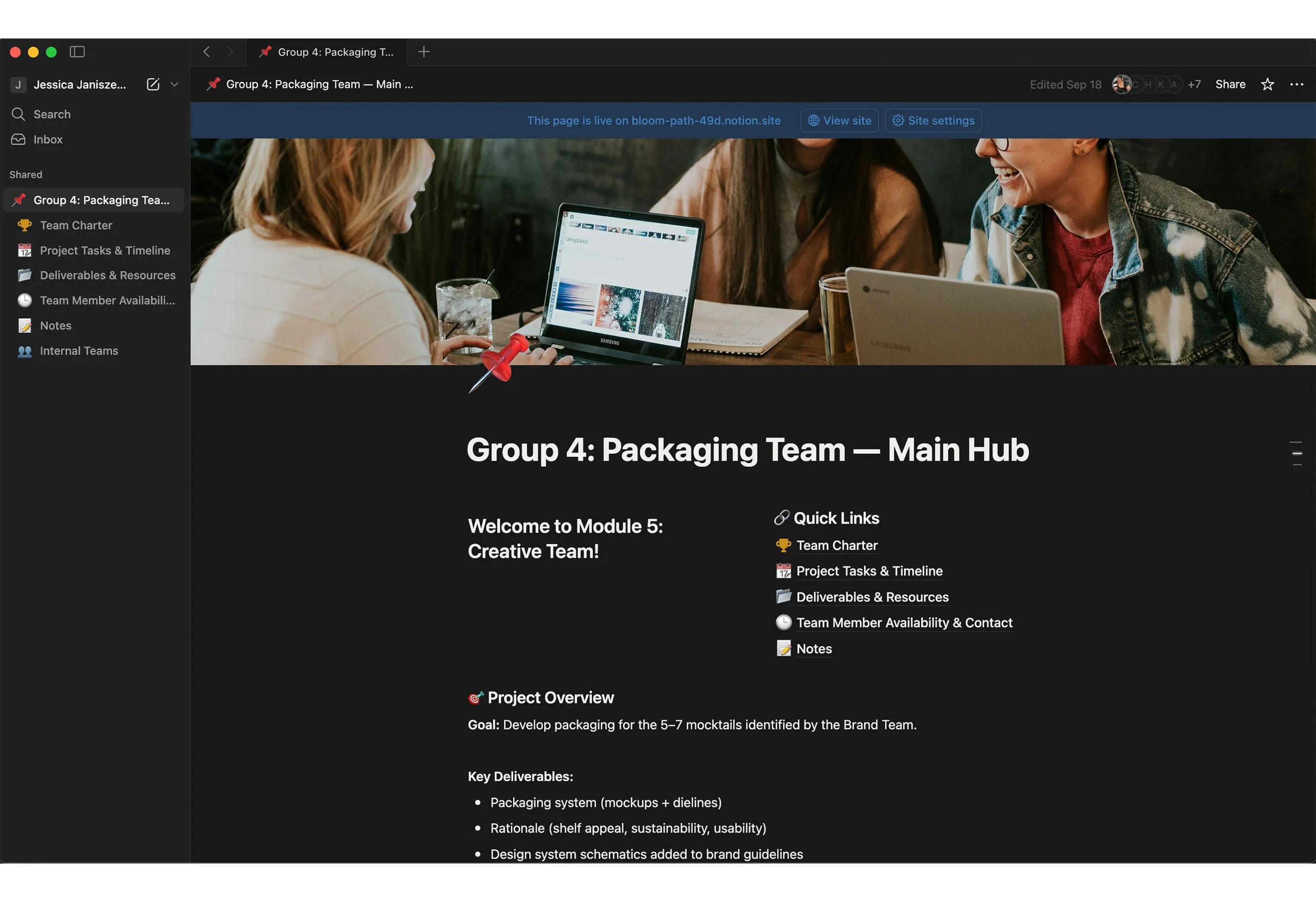
Notion Kanban board with project timeline, deadlines, and team tasks organized.
In previous group projects, there were loose strings, little to no organization within the team, and minimal communication. Having recently learned different types of workflows such as Scrum, Agile, Hybrid, etc. This was an opportunity to divulge into these workflows and put them into practice.
In this project, I created and organized Notion pages to stay on track with the team’s deadlines and progress. I implemented Kanban boards, a database of our project timeline, a table of each member’s availability, etc.
I realized some time later that not everyone would use this tool if they are not familiar with it. I quickly pivoted and focused on maintaining that space of information that our team could reference and pull from. For example, including the Brand Team’s color palettes, fonts, tone of voice, in a page rather than having them float around in our Slack channel.
Solidifying Structure: Building The Packaging Team
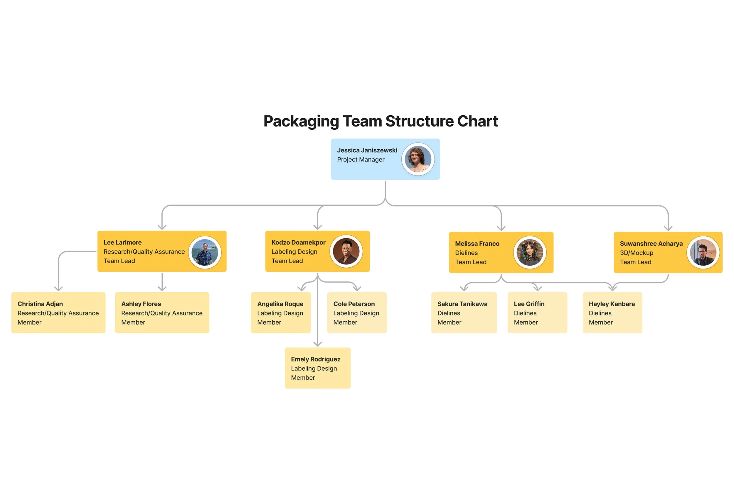
Chart showing packaging sub-teams: Research/QA, Dieline, Label Design, and 3D Mockup.
Roles were set up within our team to divide the work fairly.
Research and Regulations
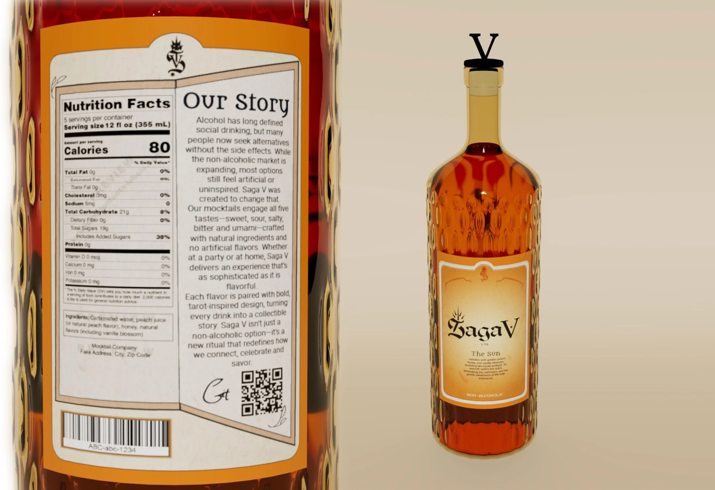
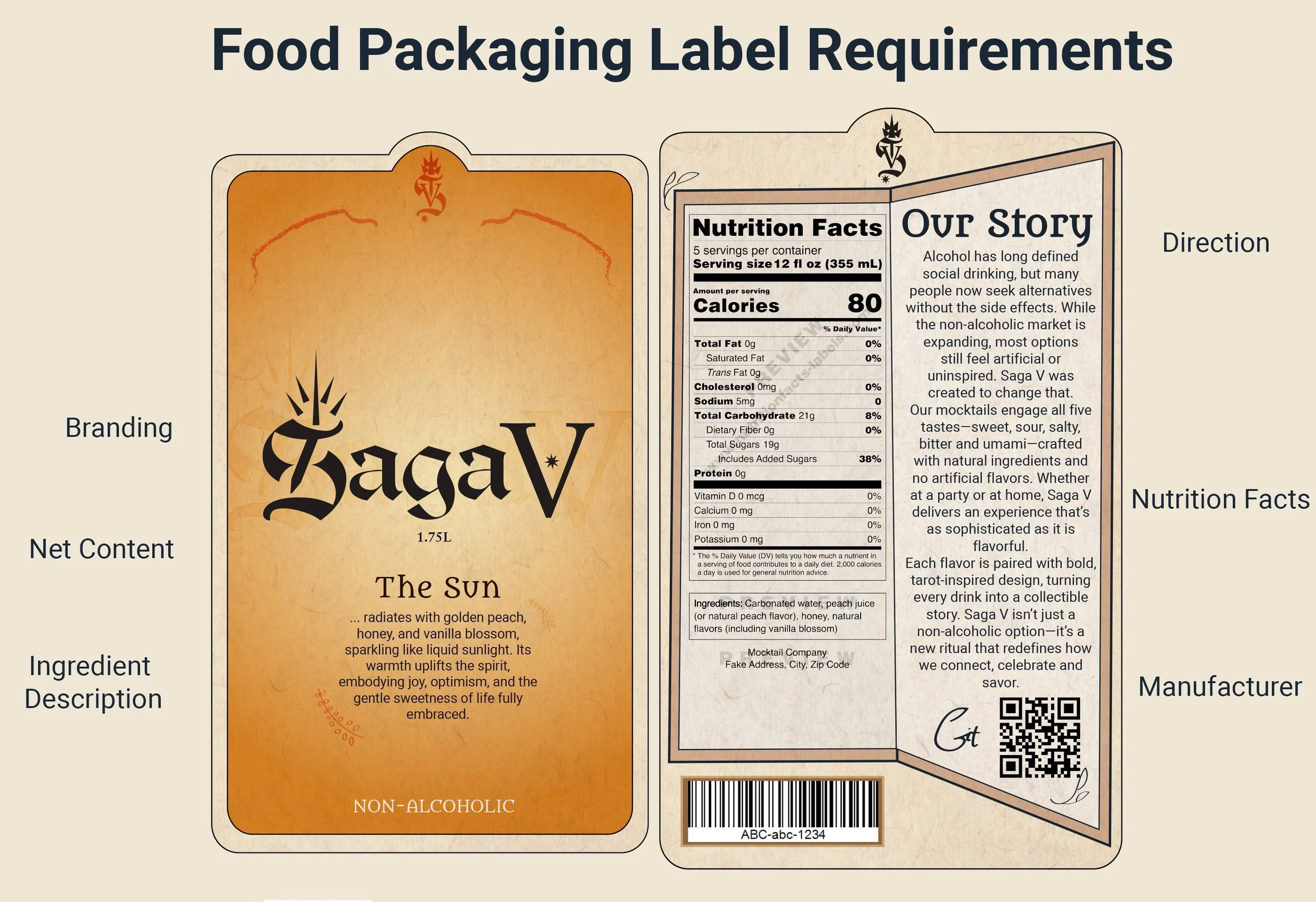
The Research/Quality Assurance Team was responsible for market research, theoretical material costs, and for final quality assurance to ensure regulatory content (nutrition facts) is correct and included properly.
Designs and Labels
The Labeling Team was responsible for designing labels that wrap around the product, ensuring all required nutritional information is included.
Dielines
The Dieline Team was responsible for drafting dielines for box packaging, making sure the packaging is secure, rigid, and high quality.
3D/Mockups
The 3D/Mockup Team was responsible for creating a 3D model of the bottle tailored to the brand and translating our packaging and logo print onto final mockups.
Finding Purpose: Research, Moodboards, and Communication
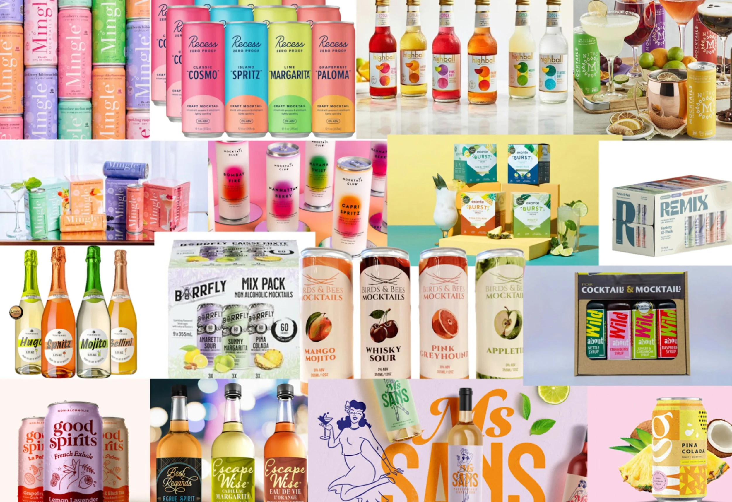
Moodboard collage of bottles, cans, and imagery used to guide packaging design direction.
There was some confusion among the team at times, as many of the members did not have much or any prior experience with packaging design, so we had to adapt quickly and figure out what problems to tackle head-on.
To address our lack of knowledge, our team made sure to research information on day one, gather mood boards, and create rough drafts.
Our key responsibilities were to figure out what material would be best suited, considering multi-packs, sustainability, establish a design system, and incorporate FDA regulations. All while making sure it retains the vision of both the stakeholder and brand.
Our direction became more clear throughout the process, especially when learning what the theme would be and if this was a premium product or an accessible one.
Any confusion within the team was resolved with clear communication from our stakeholder and cross-functional teams.
Growth Through Feedback: Iterate, Improve, Repeat
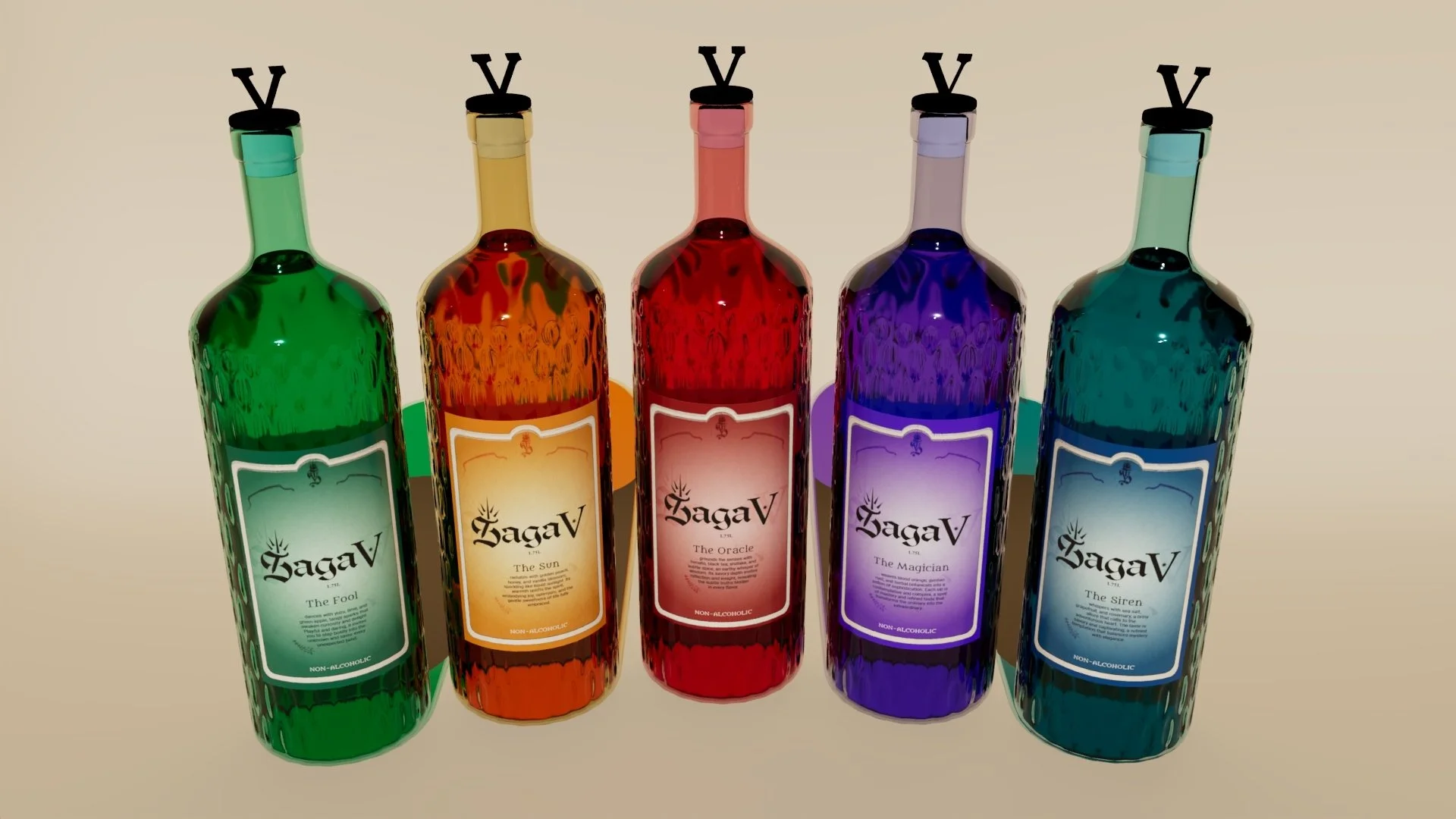
3D mockup of a mocktail bottle featuring the Saga V label design. The label displays the brand logo, modern typography, and a color palette that reflects the mocktail’s flavor and identity.
Refined packaging mockup showing final logo, colors, and label after multiple feedback rounds.
The sprints were rapid and quick. Revisions had to be made every single day. Nevertheless, with each round of revisions our team took notes on specific feedback from both our peers and stakeholders to consider, apply, and expand upon in our next design iteration, ultimately strengthening our final outcome.
I have learned a lot from this project and the importance of working with a team. In the future, I plan to continue to strengthen my skillset not only in design, but practicing skills in clear communication, collaboration, and active listening.