MTea Website Redesign
Project Requirements
This project involved designing a 1280px a single-page website from scratch using HTML, CSS, and JavaScript. The goal was to redesign a local boba shop's website while demonstrating strong fundamentals and semantic web practices.
Key requirements included implementing a light and dark mode toggle, creating a dynamic product display for featured drinks, and developing an interactive number-guessing game where users select a number between 1–10 and receive different outcomes based on generated results.
The project also required building and validating a contact form using regular expressions. Custom error messages were displayed for invalid inputs, while successful submissions triggered a confirmation message to improve user feedback and interaction.
The entire website was built using semantic HTML structure and clean, organized code, with the goal of maintaining accessibility standards and ensuring zero console errors. The project was completed within a one-week development timeline.
What the requirements inspired me to create
After reviewing the project requirements, I wanted to create something that could exist and function in the real world, such as a business with some sort of product. I looked into some local businesses' websites that I frequently visit to see if any of them were in need of improvement in layout, accessibility, and visual presentation that I could build upon.
Goals, Purpose, Users
The goal of this site was to simplify the existing website layout and improve the user's experience without creating visual clutter. The design focuses on clarity, ease of navigation, and a cohesive visual theme. The purpose of the project was to create a minimal interface that allows users to quickly go through featured menu items, contact the shop, and learn about the business with no distractions.
The target user was to include both new and usual customers looking for a fast and accessible way to browse drinks and engage with the business online. Prioritizing simplicity and usability helped ensure the experience felt welcoming and easy to use for all visitors.
Steps taken when building the site
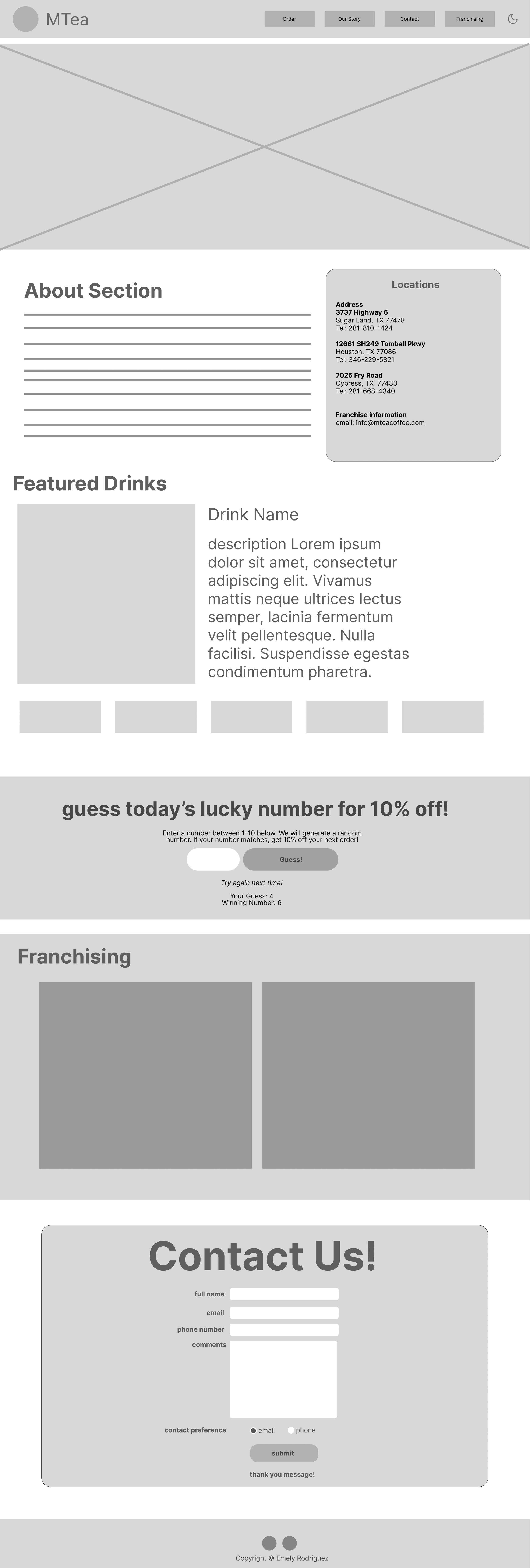
The first step I took was to sketch my ideas of a wireframe on paper. Once I settled on a design I liked, I moved on to digital work by expanding upon the sketch and creating a more detailed wireframe using Figma.
Process
Discovery & Content Gathering
At this stage, I took a deep dive online to search for high-quality resources I could use. I gathered content from the business' social media to reflect the business. This search included implementing the shop's logo, photography of the drinks found online through their social media, and linking their social media pages to implement on my site, creating a realistic and authentic experience.
All external assets and sources were credited through code comments to maintain proper attribution.
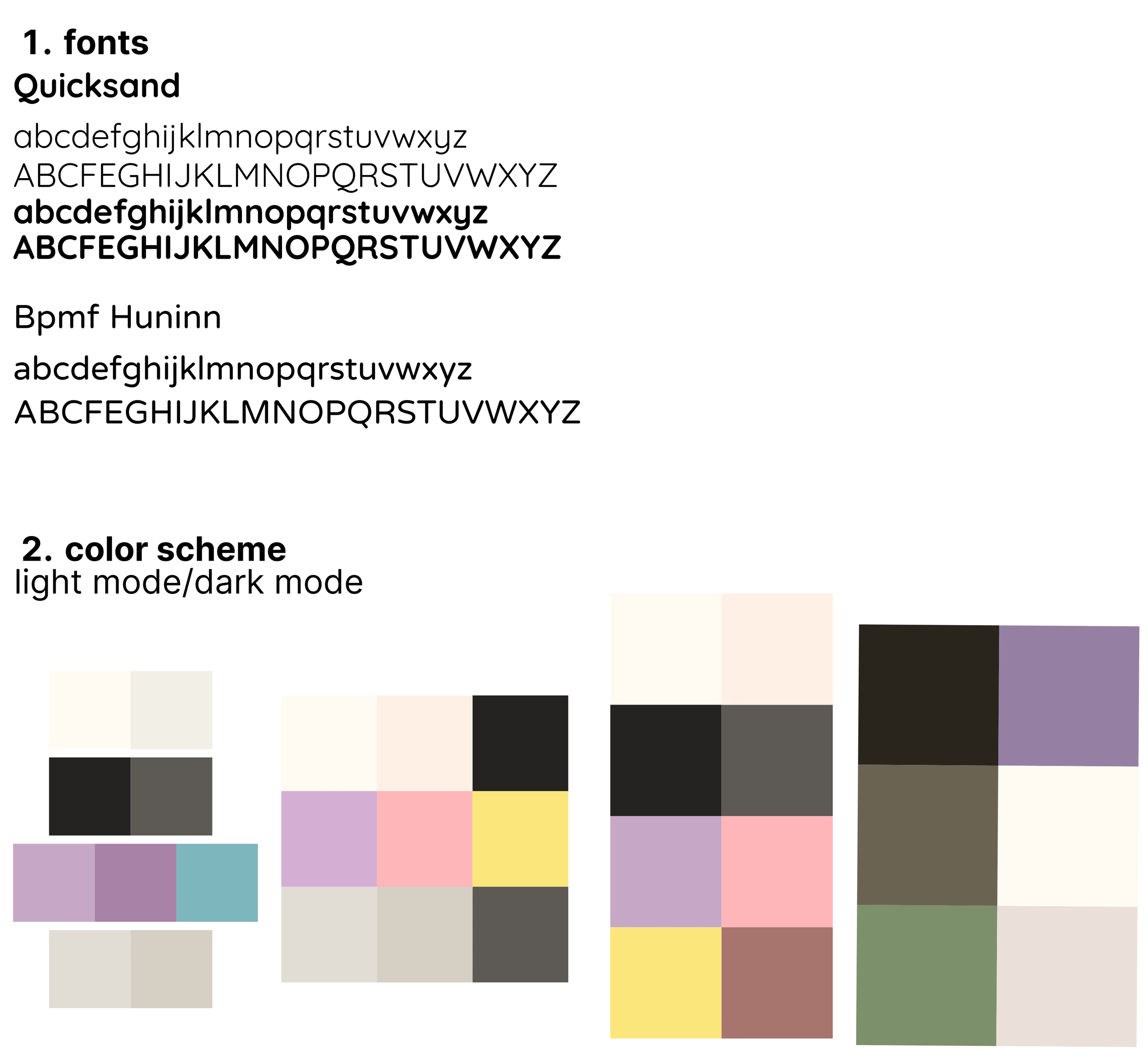
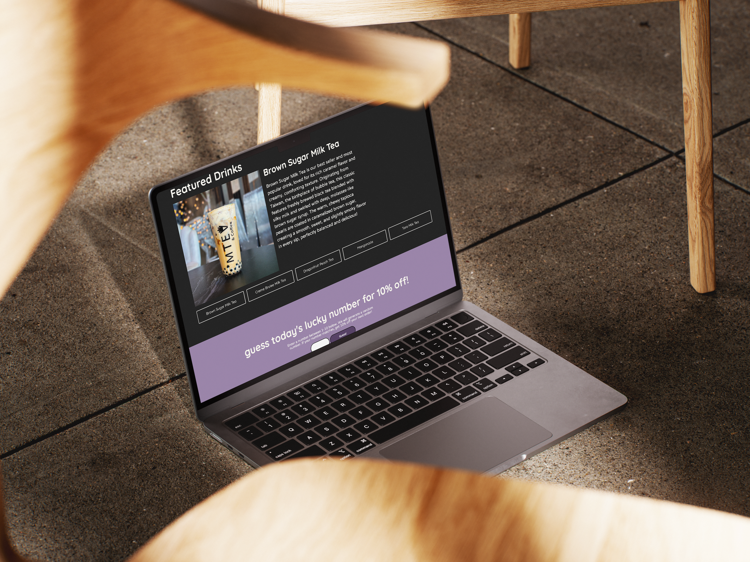
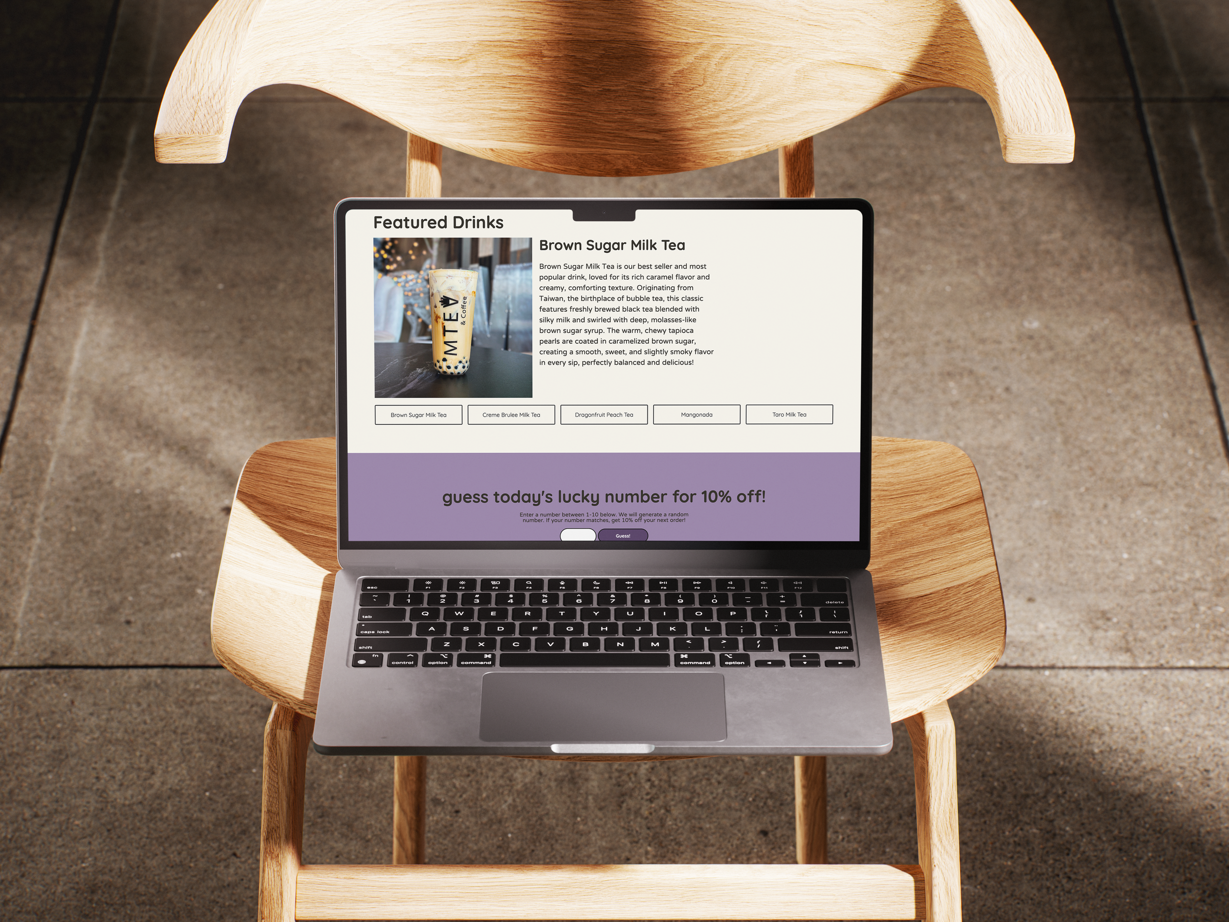
Design & Visual Direction
To establish an identity for the shop, I explored multiple color palette options using tools such as Coolors and StartUI. These tools helped experiment by allowing me to preview how the interface would appear in both light and dark modes.
The final palette uses green and purple accents:
Green represents tea flavors such as matcha.
Purple reflects taro, a popular boba flavor.
A milky white as the page's background to reflect milk tea.
Together, these colors create a recognizable theme while maintaining visual balance and contrast across the interface.
Any SVG icons were sourced from SVGrepo.
Writing the Code
The HTML structure was developed by following my wireframe from top to bottom, focusing on semantic structure to support accessibility.
Structuring the layout was straightforward. However, this project marked my first experience writing JavaScript entirely from scratch. I was intentionally careful of my IDs and semantic elements to make sure there was smooth transition between my HTML and JavaScript code.
CSS styling changed throughout development. Some design decisions were refined during implementation:
1. The franchising section was removed because it felt too text-heavy for a homepage.
2. The About section was resized differently compared to the wireframe, I paired with larger typography to improve balance and reduce the empty space.
3. Overall, layout adjustments kept changing to create stronger visual harmony across all sections.
Next Steps
If given more time, the next steps I would take for this project would focus on expanding accessibility and scalability by making it functional for mobile users. I would love to make the site a dynamic experience by introducing other separate pages such as the franchising page or a menu page that displays all the available drinks. Lastly, I would have loved to add subtle transitions in my CSS buttons to make for a smoother interactions and user experience.
What I struggled with. The most challenging part I struggled with was coding with JavaScript, as this was my first time coding with functionality in mind and with JavaScript from scratch. I felt incredibly overwhelmed due to the fact that I quickly realized that there are many approaches to implementing the elements needed. To overcome this, I took it one step at a time. I honed in on what needed adjusting, I revisited concepts when necessary, and soon getting the results I envisioned.
What I enjoyed the most. One of the most rewarding parts of the project was styling the interface with CSS and watching the design come to life visually. Seeing layout, typography, and color decisions I made come to life from concept into a fully functioning website made the development process satisfying.
To touch back on my struggles from earlier, I have to note that this process strengthened my understanding of coding logic, DOM manipulation, and planning interactive features before ahead of time. This experience genuinely helped me become more confident when approaching unfamiliar technical challenges.
Live website on GitHub Pages.